

Crunchyroll brand refresh
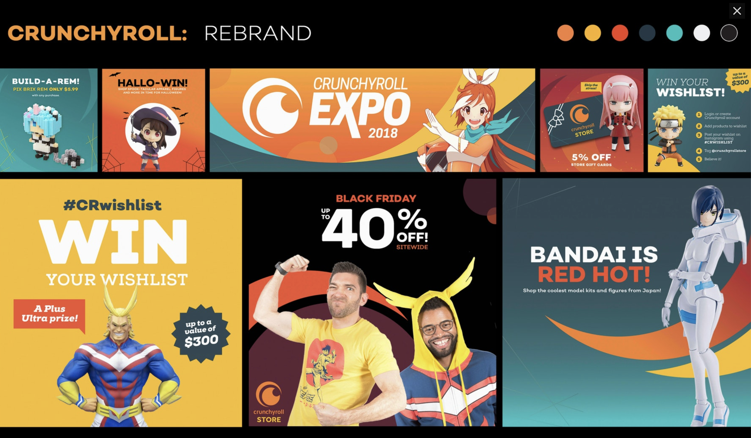
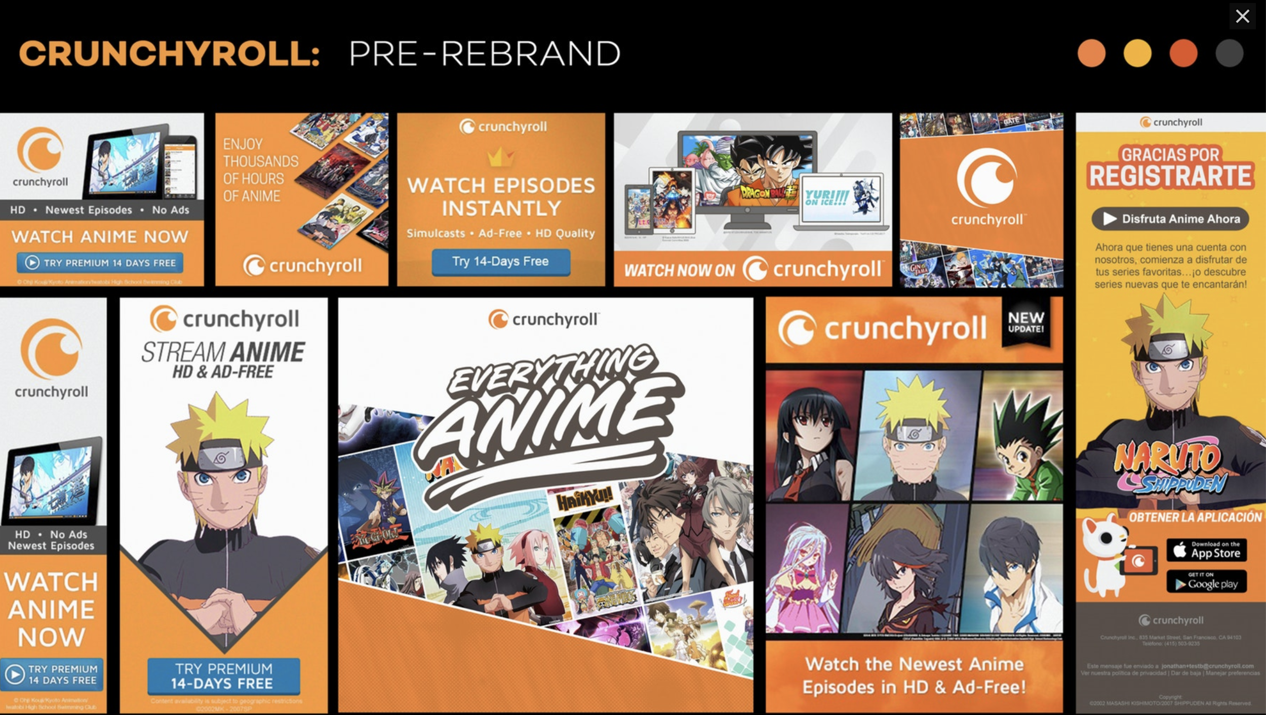
Crunchyroll wanted to refresh its brand in the potential of future rebranding overall. I worked on the refresh, which consisted of adding new colors, slimmer icons, new graphic elements, new fonts, and graphic style treatment. The concept of this project was to create a fun, upbeat style yet simple enough to not compete with the anime artwork from the licensors. A mature look that kept a playful demeanor.
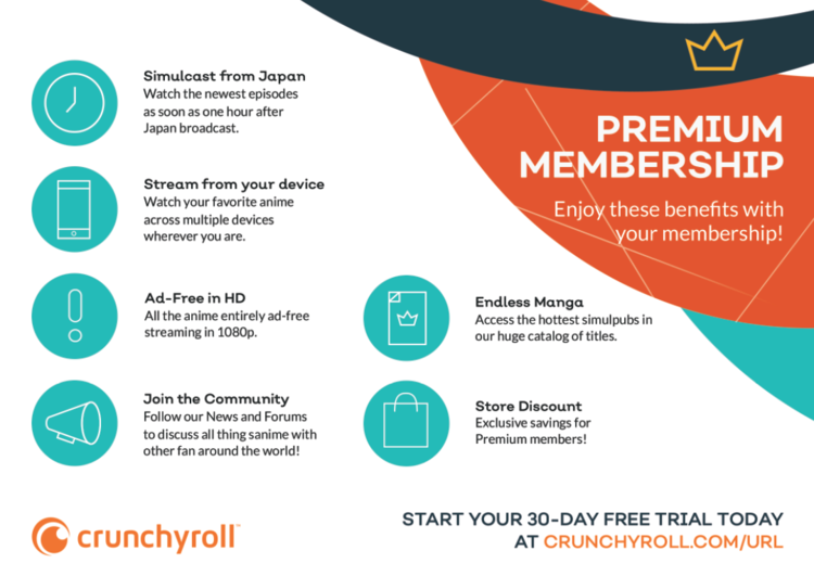
The brand would re-skin most digital and print placements, such as google ads, social posts, postcards, and conventions.
Members Involved: Aliana Rood. Ecom Art Director
Video Password: CrunchyrollRebrand2019
Editor: Bill Bergeb • Video Director: Anibal Nunez
Summit International Award-Silver
Crunchyroll’s brand refresh won silver in 2019’s Summit International Awards.
Logo positioning
Crunchyroll had come a long way in recreating their logo back in 2013. The company wasn’t ready on creating a new logo but wanted stricter use on brand placement. Working with the design team, we’ve created a guide to more stern on the use of the logo, placement and colors.
To keep the new minimal brand visuals, we limted the logo colors to primarily white, black and Crunchyroll orange.
Simplified icons
Kept true to the original form but removed the excess elements from the previous iconography used in the app, website and digital marketing.
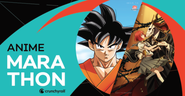

Colors and Shapes
We noticed that Crunchyroll’s palette were too warm, limiting and not accessible. Between company-wide members and app users, we wanted to widen the palette by introducing cooler colors such as navy and aqua blue. The contrast between “Tobiko Red” and Black brought a different flavor and met accessibility needs the product direly needed. The extra colors brought better balance between the orange and black without having to seem “festive”.
The design team introduced ambiguous shapes to help break traditional and symmetrical grids within assets. Using the half-moon shape from Crunchyroll’s logo, the crescents made elements with images more engaging and interesting.
Looking Ahead
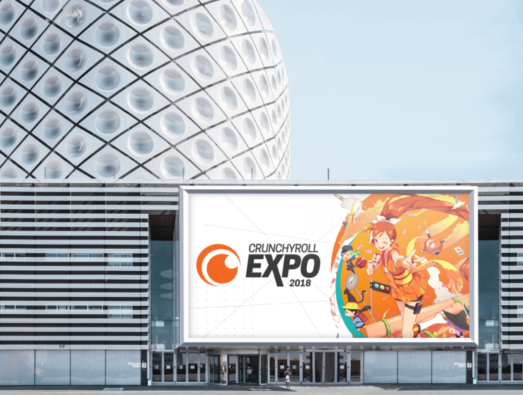
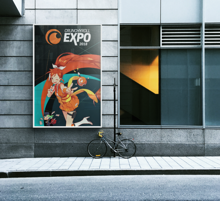
The rebrand would be applied to future conventions such as, Comic Con, Anime Expo and primarily Crunchyroll Expo. The rebrand rollout was in full force and expanded to international teams in Moldva, Japan, Spain and Portugal.