

Chime Brand Refresh
At the beginning of my position, Chime’s brand was nearly non-existent and needed a makeover. The company was already contracting the rebrand through an agency, and the plan was to take the agency’s raw files and complete it. Months later, the design team finally acquired the files, and, to our dismay, the agency was not able to deliver a complete guide, and assets were not useable.
Teaming with other designers, we were able to complete a new library of iconography and illustrations, a new color palette, and overall brand language. The rebrand echoed through the app, the company’s website, card designs, and many other front-facing material.
Members involved:
Head of Design- Samantha Berg, Iconography Design- Aoni Wang,
Design System Ops- Hass Lunsford, Content Designer- Kirby Darland

New brand, who dis?
The rebrand's release had employees and Chime members excited and felt closer to the brand than before. The new colors met accessibility standards, the font was more comfortable to read on digital screens, and the voice of the brand felt relatable. From site to physical cards, the overall brand felt more cohesive.
Elements
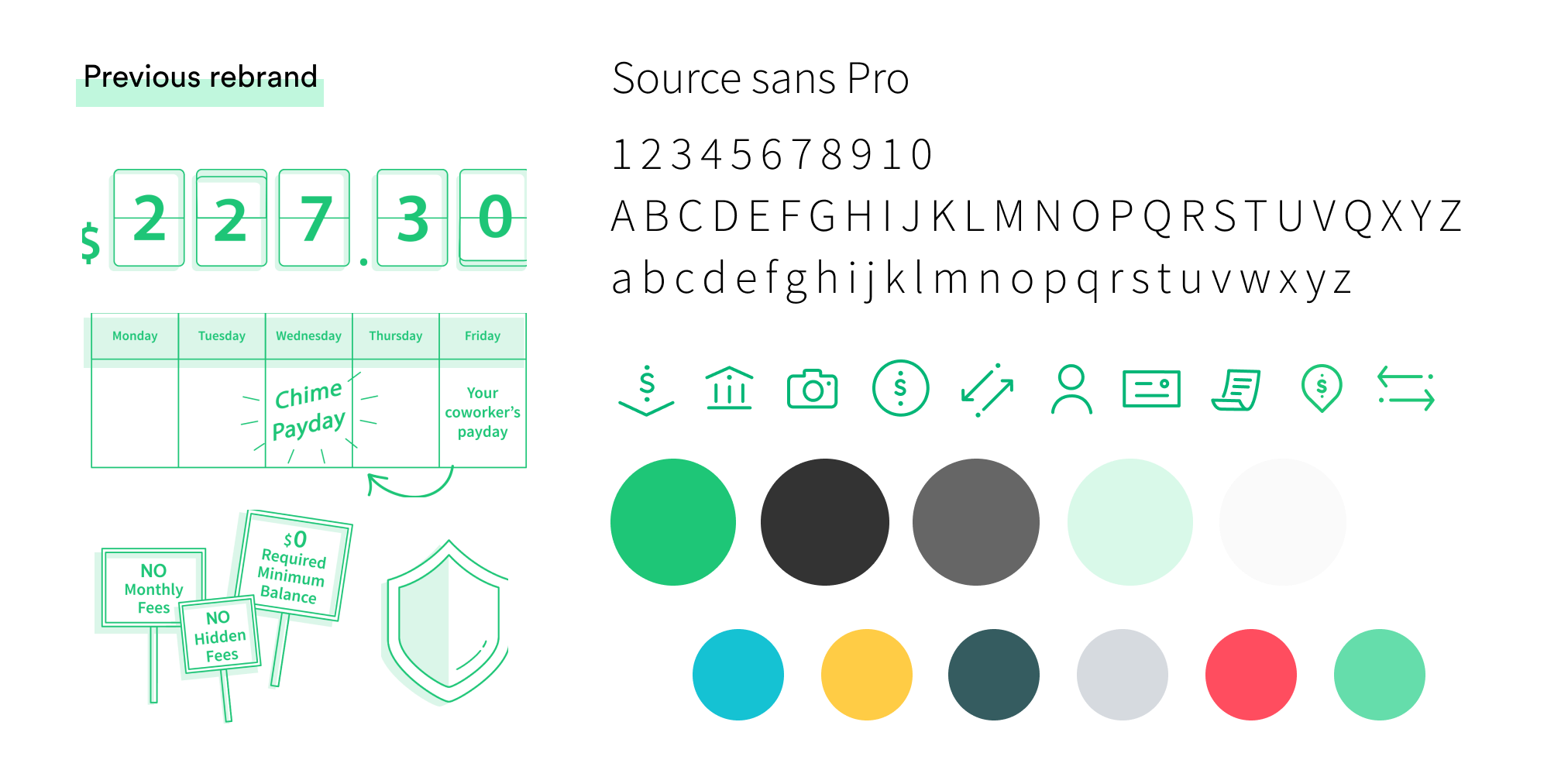
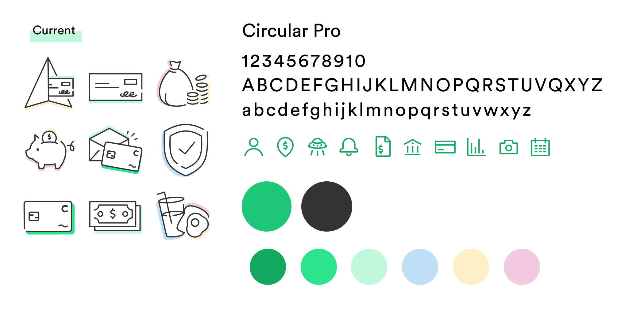
Compared to the previous brand elements, the rebrand introduced brighter and lighter colors, a library of simplified iconography, illustrations that had better regulations, and a font that made it easier to read on phone screens.

Illustrated values
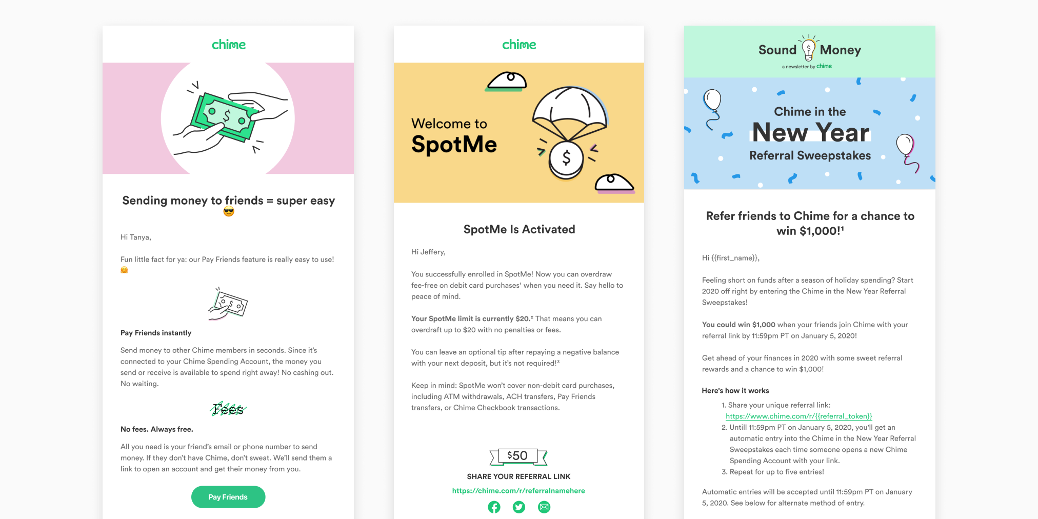
Made it a priority to create unique and dedicated illustration per feature/ Getting paid earlier, saving automatically, not paying fees, and paying friends instantly are the several of Chime's customer's favorite features. The previous brand lacked illustrations that best described these features, making it challenging to market visually. As the company continued to scale, Chime released 2 new products within a year, which were High Yield Savings, and SpotMe (fee-free overdrafts).

Homepage with old brand elements (left), New homepage with new branded elements (right)
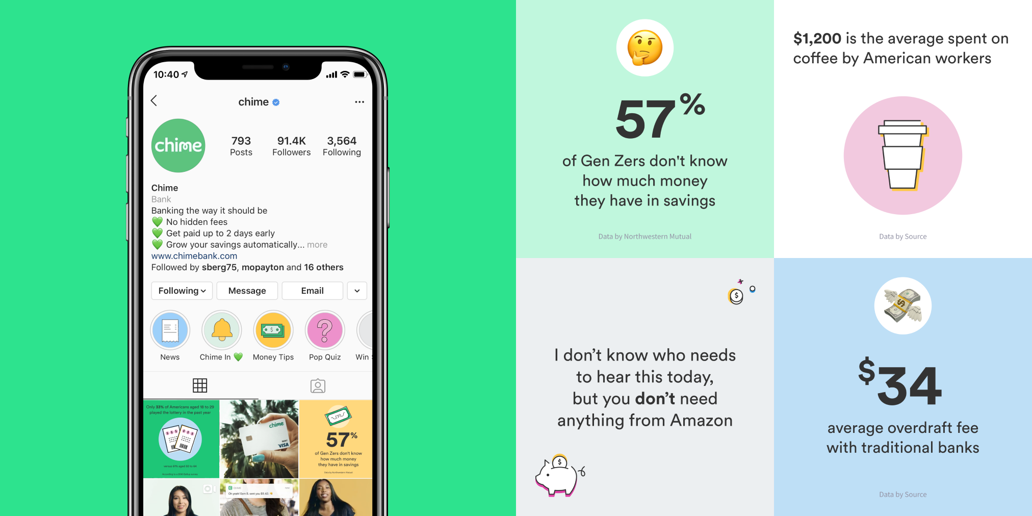
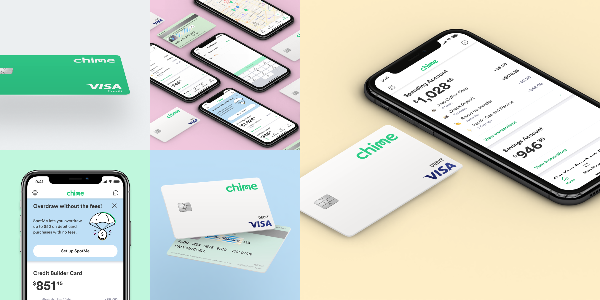
The rebrand echoed through the app, the company's website, card designs, and many other front-facing material. Chime was also known for having such a fantastic social media presence, members immediately noticed the new colors, fonts, and praised the new look. The company's brand voice was finally aligning with its visuals, and people saw it.

Working closely with the Head of Design and the rest of the Design Team, we completed Chime's first and official brand book. The brand book included the brand's voice and updated visual guidelines that reflected the company's brand as a whole. It completed the look and feel the company direly needed and agreed upon.